


Adaptability is probably the most essential need of an app. I will try to layout some of the tools and tips that I use while trying to make an app responsive towards different OS, orientations, available width and height, etc.
General Tips:
- Always set the min and max width, it helps to cover devices with XS or XL Screens
- Use Dimension API provided by react native if you want to set the width or height based on the available pixels on the device screen. This differs from using percentage as percentage would be respective to the parent View, and this is wrt the screen itself.
- Use KeyboardAvoidingView to offset the input when you open up a keyboard any platform
Dimensions API
Using as Media query
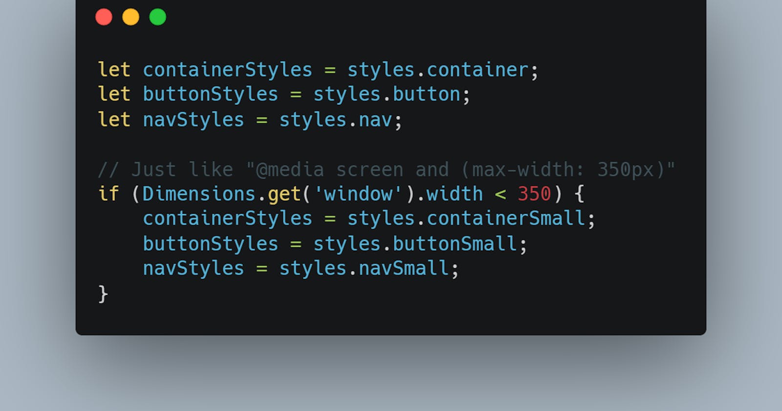
Dimensions API works can be made to work similar to media queries in CSS. Essentially you are getting the width and height of the screen and then changing the styles for different sizesAdaptability is probably the most essential need of an app. I will try to layout some of the tools and tips that I use while trying to make an app responsive towards different OS, orientations, available width and height, etc.
Dimensions object can be used any were in the JS file.
let containerStyles = styles.container;
let buttonStyles = styles.button;
let navStyles = styles.nav;

// Just like "@media screen and (max-width: 350px)"
if (Dimensions.get('window').width < 350) {
    containerStyles = styles.containerSmall;
    buttonStyles = styles.buttonSmall;
    navStyles = styles.navSmall;
}
Using directly in styling
As "Dimensions.get('window').width" gives a numerical value, we can use it to set layout styles like
imageContainer: {
    width: Dimensions.get("window").width * 0.7,
    height: Dimensions.get("window").width * 0.7,
    borderRadius: (Dimensions.get("window").width * 0.7) / 2,
    borderWidth: 3,
    borderColor: "black",
    overflow: "hidden",
    marginVertical: 30,
  },
Using for Orientation change
Dimensions are calculated when the app first renders. So if you change the orientation of the device, it won't be recalculated just by itself.
In such cases, useEffect hook provided by react, comes to the rescue.
Steps:
- Inside the useEffect hook, create a function that sets the particular style using Dimensions API
- Add an event listener to the Dimensions object for "change" event, and pass the earlier defined function as the second argument.
Like so
...
// Sets the width initially!
const [buttonWidth, setButtonWidth] = useState(
    Dimensions.get("window").width / 4
  );

  useEffect(() => {
        // Sets the widht again if the widht changes,
        // i.e, from potrait to landscape or vice versa
    const updateLayout = () => {
      setButtonWidth(Dimensions.get("window").width / 4);
    };
    Dimensions.addEventListener("change", updateLayout);

    return () => {
      Dimensions.removeEventListener("change", updateLayout);
    };
  }, []);

return (
    ...
    <View style={{ width: buttonWidth }}>
    <Button
      title="whatever"
    />
  </View>
...
)

...
More on: https://reactnative.dev/docs/dimensions
ScreenOrientation API
This API is provided by expo. The main aim of this API is to provide info about the screen orientation and then allow you to do something about it.
You get a bunch of methods to get and lock orientation, and add event listeners to any orientation change. More about the methods here: https://docs.expo.io/versions/latest/sdk/screen-orientation/
OS Specific Styling
React Native provides two ways to organize your code and separate it by platform:
- Using the Platform module.
- Using platform specific file extension.
Platform module
It let's you check which platform (IOS, android, web, etc.) your app is running on. It is super useful to set different styles for different types of platform. Use this option when only small parts of a component are platform-specific.
Here Platform.select() returns the most suitable value for the platform you are currently running on. That is if you are using an IOS device, the "ios" key will take preference!!
import React from "react";
import { View, StyleSheet, Text, Platform } from "react-native";

const Header = (props) => {
  return (
    <View
      style={{
        ...styles.header,
        ...Platform.select({
          ios: styles.headerIOS,
          android: styles.headerAndroid,
        }),
      }}
    >
      <Text>{props.title}</Text>
    </View>
  );
};

const styles = StyleSheet.create({
  header: {
    width: "100%",
    height: 90,
    paddingTop: 36,
    backgroundColor: "#CCA7B1",
    alignItems: "center",
    justifyContent: "center",
  },
  headerIos: {
    backgroundColor: "white",
    borderBottomColor: "#ccc",
    borderBottomWidth: 1,
  },
  headerAndroid: {
    backgroundColor: "#CCA7B1",
  },
});

export default Header;
More on: https://reactnative.dev/docs/platform-specific-code#platform-module
Using separate files
If you have a whole bunch of platform-specific code, a neat way to carry that out would be to split the code into multiple files.
Like so
MainButton.android.js
MainButton.ios.js
You can then use the component as shown below, and react native automatically chooses the file based on the platform the app is running on.
import MainButton from "./components/MainButton"
Super cool isn't!!
More on: https://reactnative.dev/docs/platform-specific-code#platform-specific-extensions
SafeAreaView
Not recommended but used to protect the app content from being overlapped by notches, device side-bars and things like that.